TYPEFACE DESIGN
CONCEPT
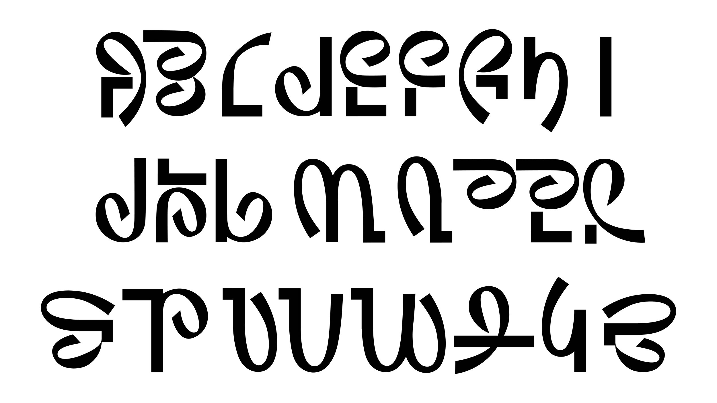
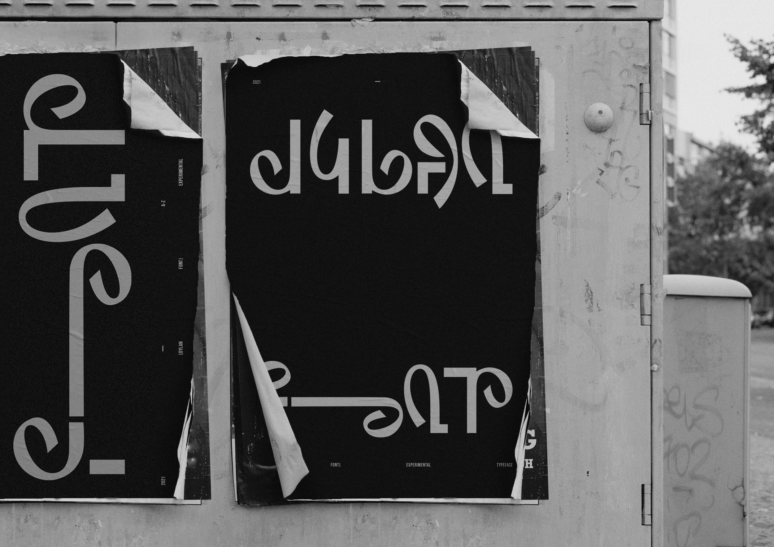
This font is a representation of what I think it’s like to be a woman. You are expected to be both soft and hard, strong and weak. I wanted to convey this in contrasting forms, to shed light on my perception of women.
The surface may look cocky, but if you look closer, there are also soft lines - The complexity of being a woman.


